The USDA report at noon EST on Thursday, October 12th will be closely watched, and could finally provide some direction and volatility from our current levels in the soybean market.
The soybeans have seen contracting volatility and base building prices for quite some time, as seen on the weekly chart below.
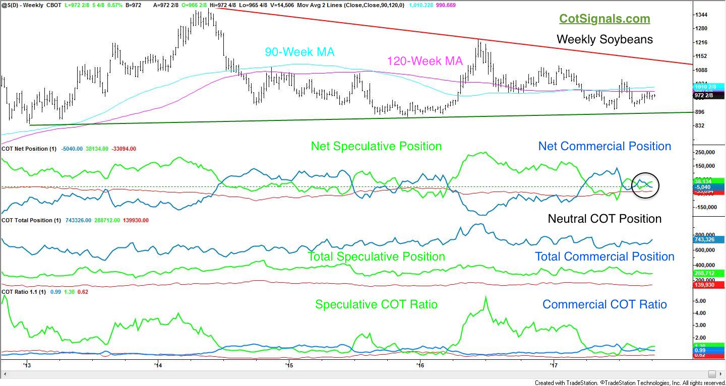
This chart indicates that both the speculative and commercial traders' positions, as reported in the weekly Commitment of Traders report are fairly balanced. Typically, we look for large imbalances that would suggest a crop report in line with the commercial traders' indications so we can trade the speculative washout. Obviously, it wasn't the COT positions that got our attention heading into this week's report.
We've been focusing on the strengthening basis over the last six weeks, and couldn't help but notice the way this ties in directly to the seasonal post-report crop strength that our algorithms are currently anticipating.
First, let's look at a couple of basis deviation maps provided by the Kansas State School of Agriculture. The charts below plot the current basis levels minus the three-year average. Basis represents the difference between the grain elevator prices, which the farmer receives and the exchange prices at which the beans are delivered. Tightening basis means that grain elevators are paying farmers more for their crops. This is the front line of the pricing structure.
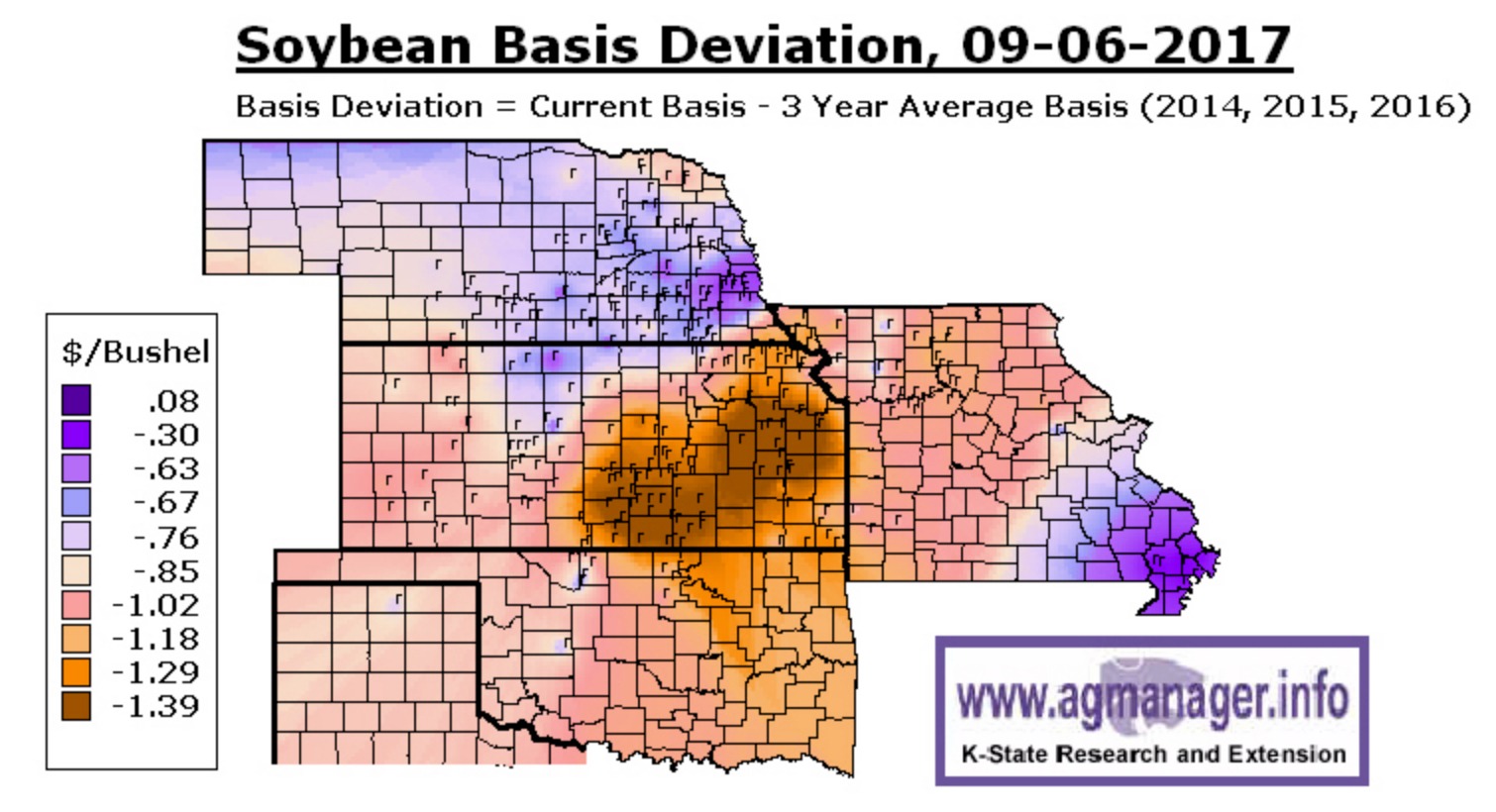
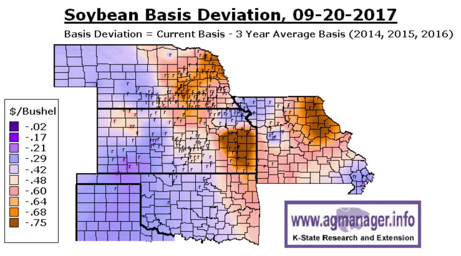
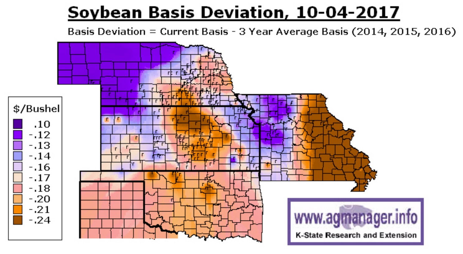
Notice how much this has changed. Six weeks ago, the most depressed levels were trading near $1.40 discount. Furthermore, the Nebraska drought lands from earlier this summer (remember that?) may not have recovered the way we think. Nebraska beans have reached a new recent premium high after falling below the board three weeks ago.
The tightening basis ahead of Thursday's report lends anecdotal evidence to the quantitative seasonal strategy we intend to deploy immediately following the report. We analyze crucial periods of previous market action to help forecast market behavior the next time these conditions present themselves in that defined window of opportunity. Of course, part of the problem with seasonal analysis is the limited amount of data. The second problem is that testing quickly determines that not all data is the same. The chart below represents the same series of tests on three different data streams from the same market.
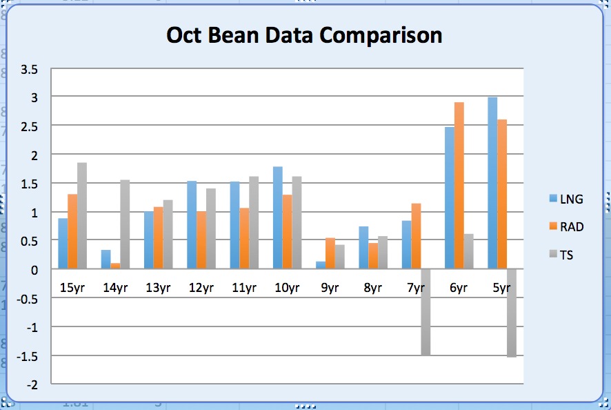
The Y-axis measures total return divided by standard deviation. I've found that it's a good measure of a program's efficiency. Don't we all want to generate positive returns relative to volatility? We also find that charts like the one above provide a better real world picture into the spectrum of returns than the more traditional rolling net return model like the one you see below for the same analysis.
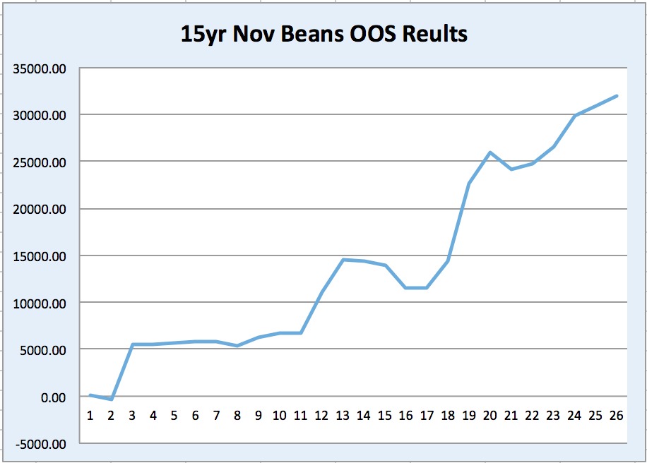
Therefore, we use advanced modeling and sampling techniques to generate statistically valid results. Rolling equity curves only show what happened in a given series of trades in the past. This provides an insufficient number of observations and is, therefore, not as likely to repeat itself going forward. The trades are valid. Every single one has tested on completely blind data but, it is still a very limited number of observations. Sampling across multiple time frames helps provide a better overall picture of the applications' trades as well as answering the question of how much of the data to use in the look back period to forecast future movement.
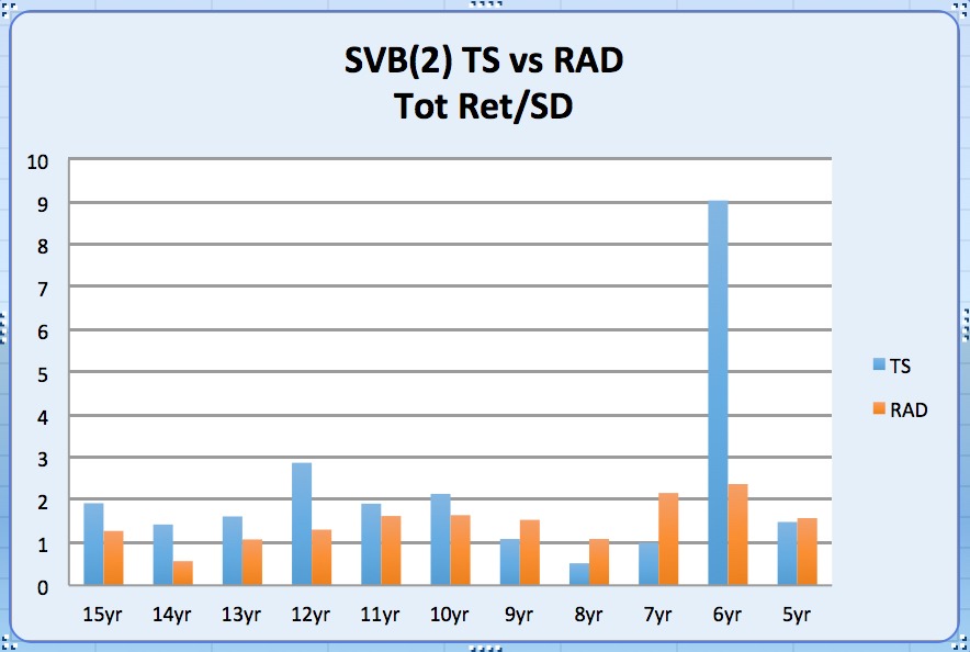
This application allows us to structure the data much more visibly and allows us points of visual reference as to what the algorithm is doing behind the scene. We'll be buying the November soybean contract following Thursday's USDA crop report. Our seasonal algorithm will use the above-mentioned factors to determine where to place our stop and when to exit the trade.
You can see more at COT Signals - Seasonal.


